Web DesignSeptember 2, 20263 min read
Why Responsive Design Still Matters in 2026
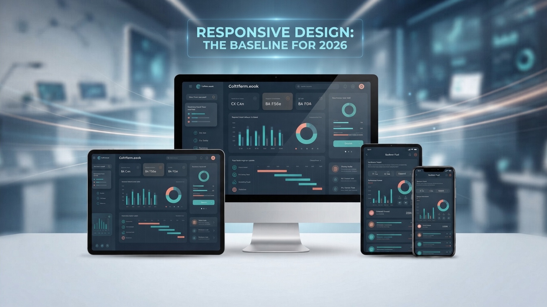
Responsive design isn't a feature — it's the baseline. With over 60% of all web traffic coming from mobile devices, a site that only looks good on a desktop is a site that's losing customers.
But responsive design in 2026 means more than just "it shrinks on a phone." It means your layout reflows intelligently, your tap targets are large enough for fingers, your images load at the right size for the screen, and your text is readable without pinching and zooming.
It's Not Just Layout — It's Behavior
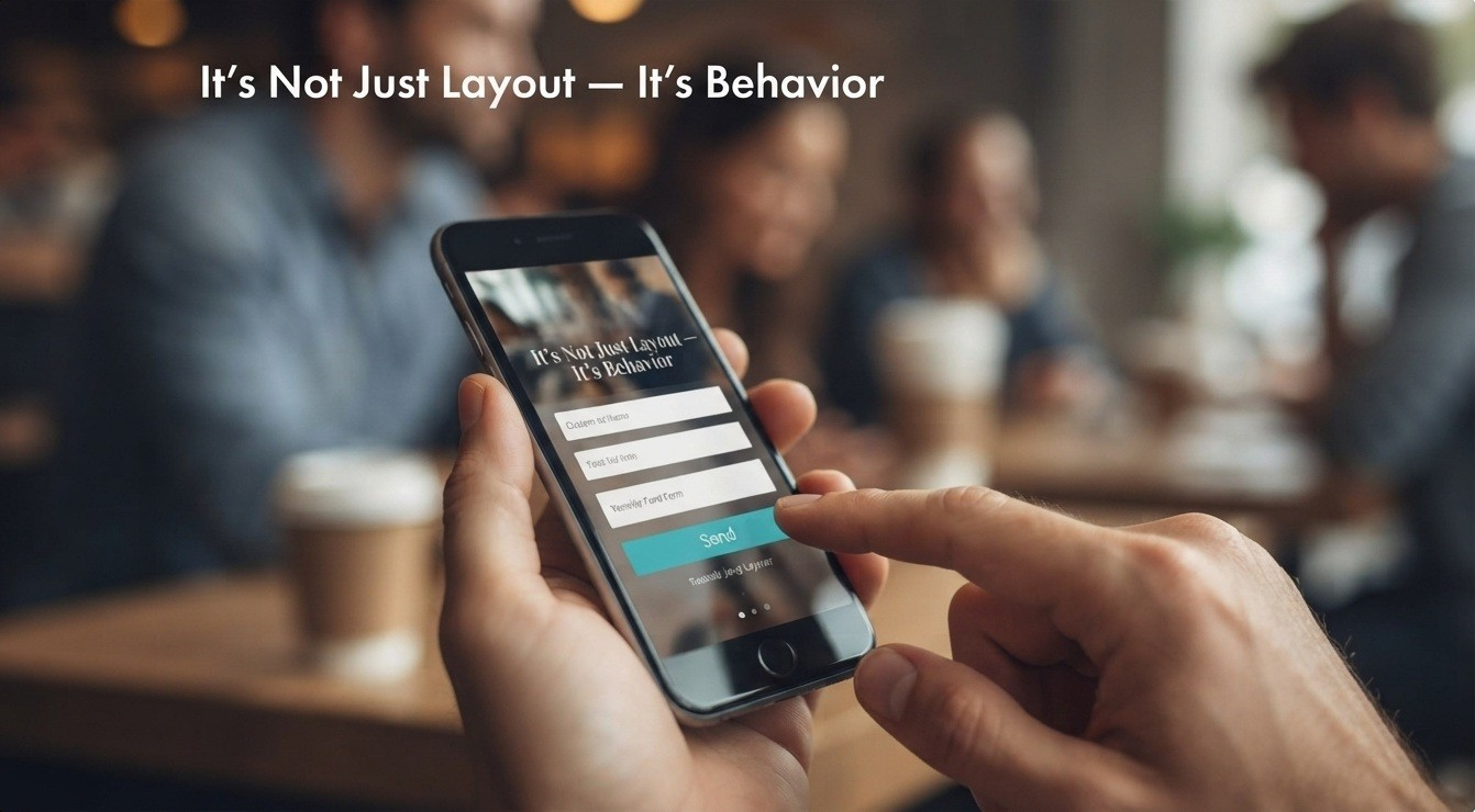
A lot of sites technically "pass" the mobile test. The logo shrinks, the menu collapses into a hamburger icon, the columns stack. But that's the bare minimum, and visitors can tell the difference between a site that was designed for mobile and one that was merely squeezed onto it.
Real responsive design adapts behavior, not just dimensions. Forms should be easy to fill out with a thumb. Buttons should be spaced so you don't fat-finger the wrong one. Navigation should assume someone is scrolling one-handed, possibly with one eye on a checkout line, not sitting still with a mouse.
Performance Is Part of the Design
It also means performance. A truly responsive site loads fast on a 4G connection, not just on fiber. Every extra second of load time costs you visitors — and revenue.
This is the part that gets skipped most often. A site can look perfectly responsive and still feel broken if it takes six seconds to load a hero image on a phone with a weak signal. Image compression, lazy loading, and lean code aren't backend details — they're part of the design experience, because speed is something a visitor feels before they read a single word.
Mobile Isn't the Afterthought Anymore — It's the Test
The brands that win are the ones that treat mobile as the primary experience, not an afterthought. Your customers don't care how your site looks on your office monitor. They care how it looks on their phone, in line at the grocery store.
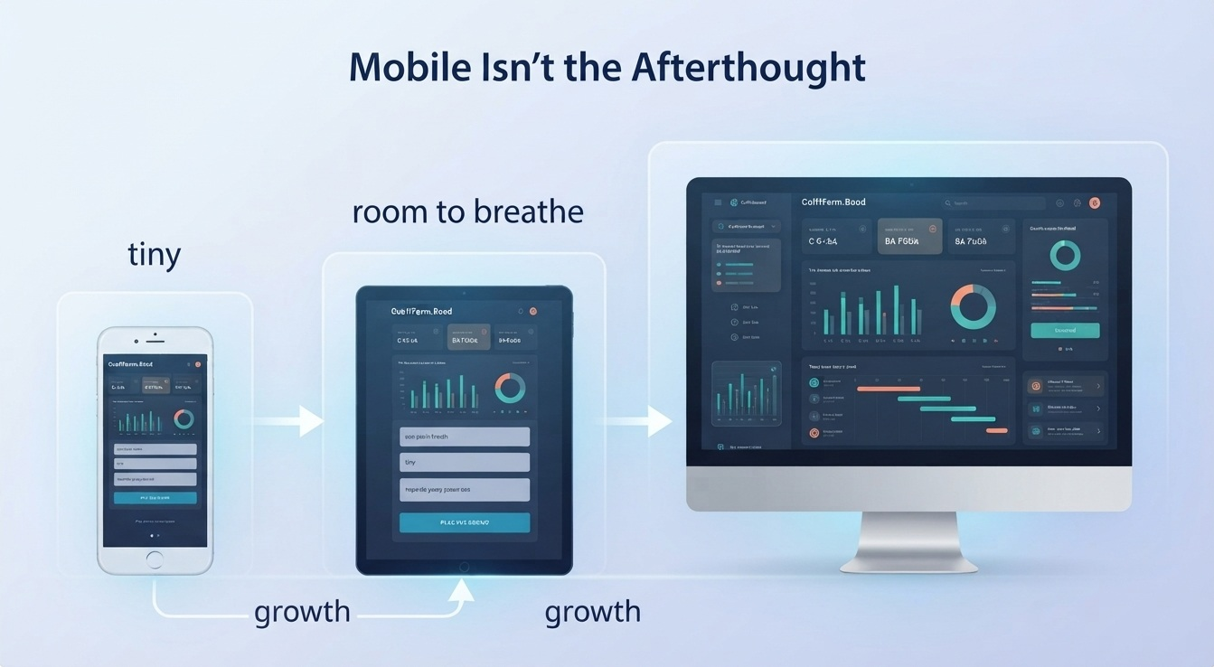
That shift in thinking changes how a site should be built from day one. Instead of designing for a big screen and shrinking down, the smarter approach starts with the smallest screen and builds up. What's essential on a 6-inch display usually turns out to be what's essential everywhere — it just gets more room to breathe on desktop.
What We Build
Every site we build is responsive from the ground up. Not because it's trendy, but because it's how people actually use the web.
That means every layout is tested against real mobile behavior — not just resized in a browser window, but checked for tap accuracy, load speed, and readability on the devices people actually carry around. Responsive design isn't a checkbox at the end of a project. It's the lens the whole project gets built through, because a site that doesn't work in someone's hand doesn't really work at all.
Share this post:
Want a custom app, website, or SaaS platform built fast?
Explore Our Services